

Coronavirus Data Visualisation
About
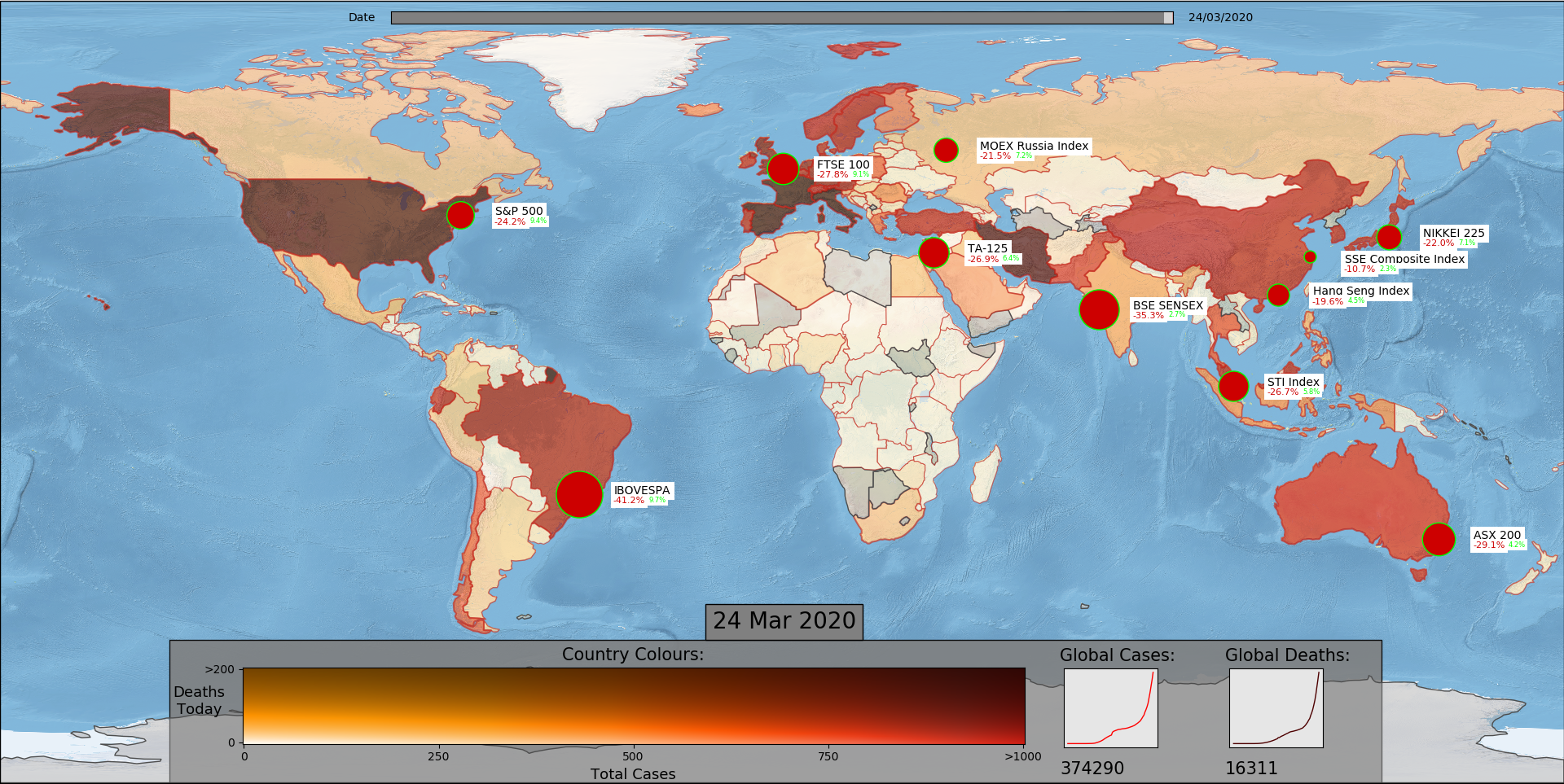
Interactive live data visualisation project to show the global spread of the Coronavirus. Includes geographic mapping of the COVID-19 epidemic, representing country cases and deaths using a colour heat matrix. Overlay of economic data on closing price of major world indices to show the economic impact of the crisis.
Data sourced live from the ECDC and Yahoo Finance.
Visualising Data
To most clearly present the geographic significance of the statistics, I used a 2D colour matrix to convey both daily death and total case data, with economic data superimposed ontop.
More details of the project can be found on my GitHub.
Interactive Example
Below is a similar interactive data visualization from Our World in Data. No economic data is included.